Disclosure: This post may contain affiliate links, if you purchase any products or services through our affiliate links, we may receive a commission at no additional cost to you.
In email marketing, it matters not just what you say but how you say it. A well-designed email can increase open rates, enhance engagement, and lead to higher conversions. MailerLite provides powerful design tools and customizable templates that help businesses create professional, eye-catching emails with ease.
In this guide, we’ll share seven email design tips using MailerLite’s templates, including layout strategies, best practices for mobile optimization, and techniques for creating visually compelling content.
Table of Contents
1. Choose the Right Template for Your Goal
Your email’s effectiveness begins with selecting the right template. MailerLite offers a variety of pre-designed templates for different purposes, such as newsletters, product updates, promotional emails, and event invitations. Each template is fully customizable, making it easy to align with your brand’s unique style.
Tips for Choosing the Right Template:
- Align with Your Objective: If you’re sending an educational newsletter, use a clean and simple template to keep the focus on the content. For product promotions, try a bold, image-centric template to highlight your offerings. Selecting a template that matches your content style will make the information flow better for readers.
- Experiment with Different Layouts: Even within the same category, different templates create different effects. A one-column layout may work well for simple updates, while a multi-column layout can feature multiple products or sections. For example, a two-column layout might showcase both new and trending products side by side, helping customers navigate easily.
- Consider Seasonal Templates: MailerLite often offers templates with seasonal themes, which can make your emails feel fresh and timely.
Example: If you’re an e-commerce business promoting a seasonal sale, use a vibrant, image-based template that showcases your top products and includes clear CTAs (Call to Action) for each. Pair it with a header that highlights the promotion for an eye-catching start.
2. Customize for Brand Consistency
Keeping your emails visually consistent with your brand helps reinforce brand recognition and credibility. MailerLite’s templates make it easy to customize colors, fonts, and images, so each email feels like a natural extension of your brand.

How to Maintain Brand Consistency:
- Use Brand Colors and Fonts: With MailerLite’s editor, you can easily adjust the colors and fonts in each template. Consistently using your brand colors and typography creates a cohesive look across emails. It also reminds subscribers of your brand even before they’ve read the content.
- Add Your Logo: Make sure to include your logo in the header or footer of each email. This simple addition not only reinforces brand identity but also helps subscribers recognize your emails immediately. A recognizable logo boosts your open rates and builds trust over time.
- Create a Branded Signature: MailerLite allows you to customize your email signature. Including a branded signature with your contact information, logo, and even social media links adds a professional touch.
Pro Tip:
If you have design guidelines, stick to them when customizing templates. Consistency in color schemes, fonts, and visual elements strengthens your brand presence in subscribers’ inboxes. For example, if your brand colors are green and black, avoid adding unrelated colors, which may dilute your visual identity.
3. Use High-Quality Images and Visuals
Images make emails more visually appealing and communicate messages more effectively than text alone. MailerLite’s templates make it easy to incorporate high-quality visuals, from product photos to eye-catching banners.
Best Practices for Using Images:
- Choose Images Wisely: Select images that support your message and match your brand. High-quality product images are essential for e-commerce emails, while infographics or illustrations might work better for educational content. Avoid stock photos that feel generic, and try to showcase authentic visuals that resonate with your audience.
- Optimize for Fast Loading: Large images can slow email load times, especially on mobile devices. MailerLite allows you to resize and optimize images within the editor, helping to maintain quick loading times without sacrificing quality. This can help reduce bounce rates on mobile.
- Consider Adding Alt Text: For images that don’t load properly, adding alt text can help convey the message to subscribers. Alt text also makes your email more accessible to visually impaired users, which improves overall engagement.
Example: If you’re a lifestyle brand sharing a newsletter with seasonal content, use vibrant, seasonal images that reflect the theme of the email, like summer colors or winter landscapes. These images will create a mood for readers, making them more likely to click through.
4. Write Attention-Grabbing Headlines
The headline is often the first thing subscribers see when they open an email, so make it count. An engaging headline can dramatically increase open and click-through rates, driving more engagement with your content.
Tips for Writing Strong Headlines:
- Keep It Short and Clear: Aim for a concise headline that gets straight to the point. Subscribers should understand the main value or message right away. If you’re offering a sale, try “Flash Sale: 24 Hours Only!” to create urgency.
- Use Power Words and Personalization: Words like “exclusive,” “new,” or “limited-time” create urgency and interest. Personalizing headlines with the subscriber’s name can also improve engagement. For instance, “Special Offer for You, Sarah!” feels tailored to the reader.
- Highlight the Benefit: Instead of “New Product Line,” try something like “Discover Our Fresh Styles for the Season!” to create a sense of excitement. This shows subscribers the value of opening the email right away.
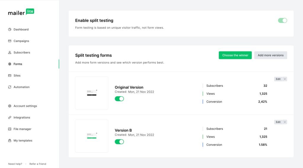
Pro Tip: A/B test different headlines to see which style resonates most with your audience. MailerLite’s A/B testing feature allows you to try two versions and analyze which drives higher engagement. Testing can reveal preferences like “New Arrivals” vs. “This Season’s Must-Haves.”
5. Keep Your Layout Simple and Mobile-Friendly
A clean, simple layout is often the most effective, especially when considering mobile users. MailerLite’s templates are designed to be responsive, so they look good on any device. However, there are extra steps you can take to ensure mobile-friendliness.
Mobile Optimization Tips:
- Limit Columns: Stick to a single-column layout when possible, as it’s easier to read on mobile screens. Multi-column layouts may look cluttered on smaller screens, which can deter readers from engaging with your content.
- Use Large Buttons and Fonts: Small buttons and fonts are harder to tap on mobile devices. Increase font size for readability and make sure CTA buttons are large enough to click comfortably. Aim for at least 16px for body text and a minimum of 40x for buttons.
- Preview Before Sending: MailerLite’s preview feature lets you see how your email will appear on both desktop and mobile. Always double-check this to avoid layout issues. Small adjustments may improve readability significantly.
Example: For a product announcement, use a single-column layout with large, clear product images, brief descriptions, and a prominent “Shop Now” button that’s easy to tap. Adding white space between sections makes the email look less crowded on mobile.
6. Include Clear CTAs (Call-to-Action)
Your CTA is the most critical part of your email, as it is the action you want your subscribers to take. Whether it’s “Learn More,” “Buy Now,” or “Subscribe,” make sure your CTA is clear, concise, and visually distinct.
Best Practices for CTAs:
- Use Action-Oriented Language: Words like “Discover,” “Save,” or “Claim” create a sense of urgency and encourage action. Phrasing like “Claim Your Discount” is more enticing than a simple “Click Here.”
- Make It Stand Out: Use MailerLite’s design tools to style your CTA button. Use contrasting colors, bold fonts, and a large button size so it’s easy to find and tap. This makes it clear that the CTA is the next step.
- Limit to One Main CTA: Too many CTAs can overwhelm readers. Stick to one primary CTA per email, with possibly a secondary CTA in the footer. Keeping it simple improves clarity and conversion rates.
Example: In a promotional email, instead of using a generic “Click Here,” make your CTA more descriptive, like “Get 20% Off Your Order.” This provides clarity and incentivizes the click. Place the CTA in a prominent area where it’s easy to spot right away.
7. Test and Analyze Your Designs
To ensure your email designs are effective, regularly test and analyze their performance. MailerLite’s A/B testing and analytics tools let you experiment with different design elements and track engagement metrics.
Testing Elements in MailerLite:
- A/B Testing: Test different versions of your email to see which layout, color scheme, or CTA performs better. Try changing one element at a time for accurate results. Testing layout variations, like single-column vs. two-column, helps you understand what resonates best.
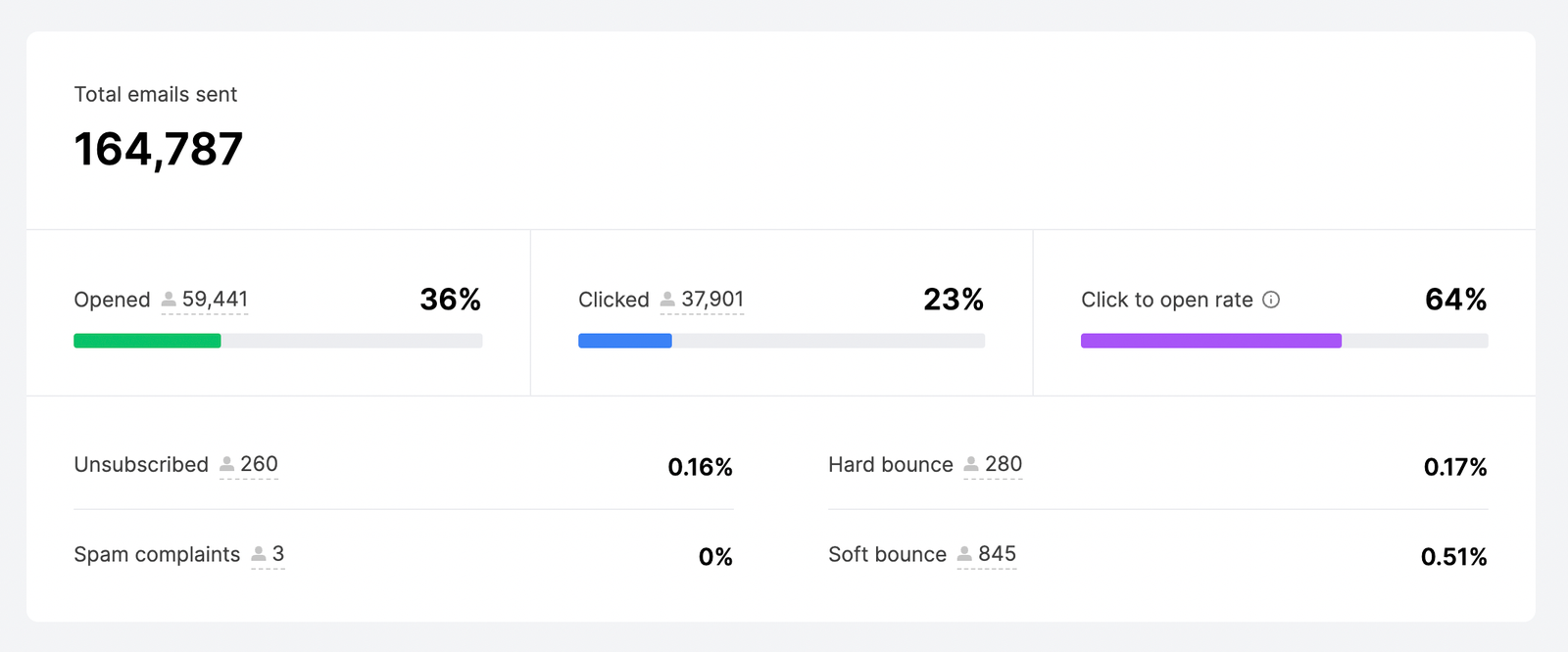
- Track Key Metrics: Open rate, click-through rate (CTR), and conversion rate provide insights into how well your design resonates. Low open rates may suggest the need for more engaging subject lines or headlines, while low CTRs may indicate that your CTA needs improvement. MailerLite’s analytics make it easy to identify areas for refinement.
Pro Tip:
After each email campaign, review the data in MailerLite’s analytics dashboard. Identify which design elements performed well and incorporate those insights into future emails. Analyzing patterns over time helps you fine-tune your designs for continuous improvement.
Avoiding Common Design Mistakes
Common design mistakes to avoid when creating emails:
- Overcrowding with Images and Text: Too much content can overwhelm readers and detract from your main message. Keep your layout clean by using white space strategically, limiting the number of images, and focusing on key information. For longer emails, consider using MailerLite’s “Read More” links to drive traffic to your website, rather than overloading the email itself.
- Not Optimizing for Mobile: With over 50% of emails opened on mobile devices, it’s crucial to test your email design across different devices. A design that looks great on a desktop might appear cluttered or unreadable on a phone. MailerLite’s preview feature allows you to see how your email will look on various screen sizes, ensuring a seamless mobile experience. Avoid complex layouts, and use larger buttons and fonts to improve readability on smaller screens.
- Using Unclear or Weak CTAs: Emails should guide readers to take a specific action, so ensure your CTA is obvious and easy to locate. Avoid using vague or overly subtle phrases like “Click here” or “Find out more.” Instead, opt for action-oriented language that communicates the benefit, like “Get 20% Off Now” or “Reserve Your Spot.”
- Skipping Previews and Tests: Always preview your email and send test emails to yourself or a colleague. This ensures everything from layout to links is working correctly. Reviewing the email in different email clients and devices (such as Gmail, Outlook, mobile, and desktop) can reveal inconsistencies or minor issues that may affect the reader’s experience.
Conclusion
MailerLite’s templates and design make creating polished, engaging emails that drive results easy. By following these seven design tips, you can enhance your emails’ visual appeal, boost open rates, and increase engagement with your subscribers.
Related Post:
How to Grow Your Subscriber List Quickly with MailerLite
Email Automation Made Easy: A Beginner’s Guide to MailerLite Workflows
Affordable and Powerful: Why MailerLite is the Perfect Choice for Small Businesses
MailerLite Analytics: How to Measure and Improve Campaign Performance